Over the years I've done a lot of mapping with deprivation data from the various deprivation indices in use across the UK. I've also built
a separate website based on the 2012 Scottish Index of Multiple Deprivation (screenshot below).
 |
| My SIMD mapping site |
I've embedded a map from this site below, so you can play around with it but it's best to go to the full size. Click on an area to reveal more and to see how the area has changed in terms of deprivation rank between the various iterations of the SIMD from 2004 to 2012.
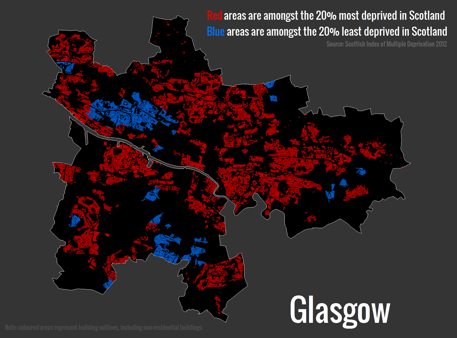
In addition to the interactive maps, I've also produced lots of different kinds of maps showing deprivation in major Scottish cities in relation to the most and least deprived areas. The one below shows the most and least deprived 20% of Data Zones in Aberdeen, Dundee, Edinburgh and Glasgow from the SIMD 2012.
These maps help highlight social and spatial inequalities and in Glasgow in particular you can see that a large part of the area within the city boundary is coloured red to indicate it is within the 20% most deprived in Scotland. In the image below I've taken this a little further and shown only those areas where there are buildings (including non-residential ones). This technique is knows as 'dasymetric' mapping and although it's not perfect it does give a better indication of the underlying urban fabric.
There is of course much more to 'deprivation' than meets the eye and we should be careful about making assumptions about areas (and people) on the basis of these classifications. However, they are important because they are used extensively by local and national governments in Scotland - in addition to a wide range of other users. I've written a bit more about what it all means over
on my SIMD pages.

